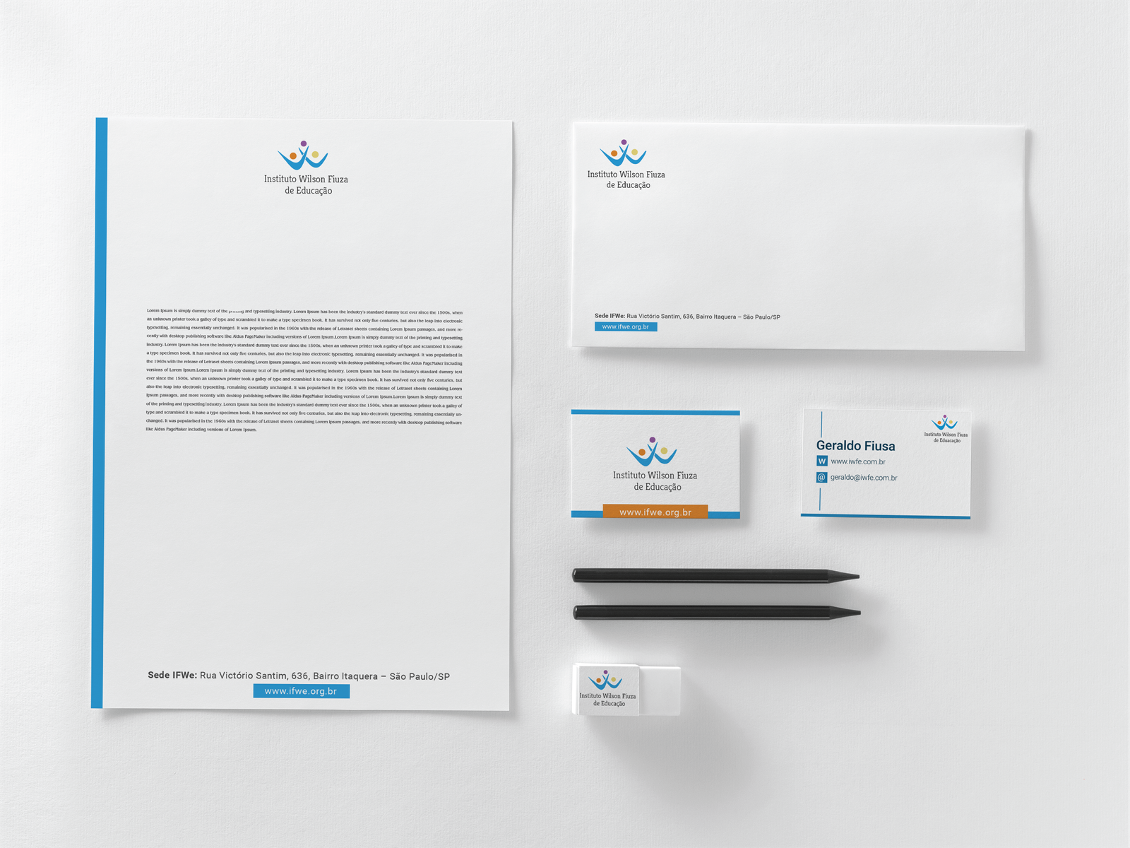
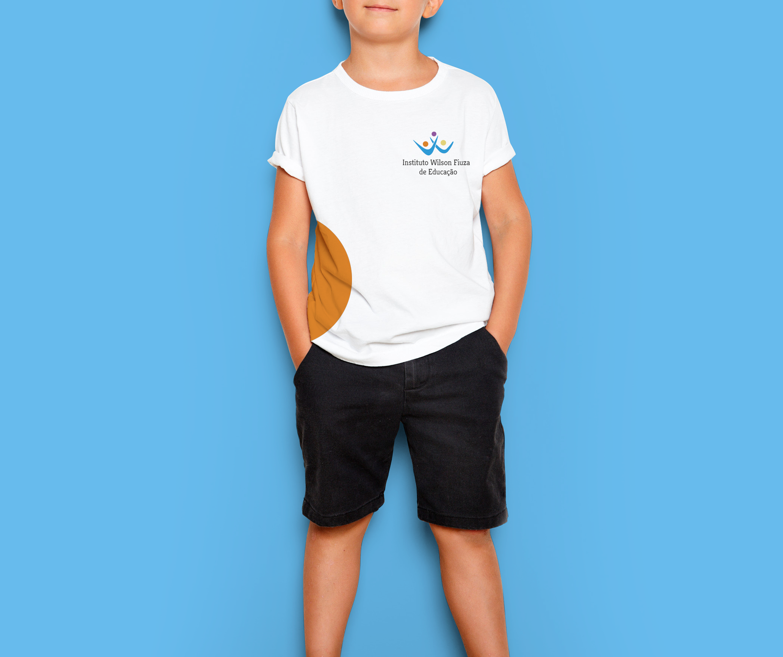
The Wilson Fiusa Institute of Education is a Brazilian NGO that has been dedicated to the mission of protecting, educating, and transforming since 2007. For over a decade, they've been on a journey to make a positive impact, ensuring that every step they take is a step towards a brighter future. From safeguarding to enlightening minds, their commitment to change is not just a goal but a continuous effort that inspires growth and empowerment. Join them on this transformative journey as they shape a better tomorrow through education and compassion.

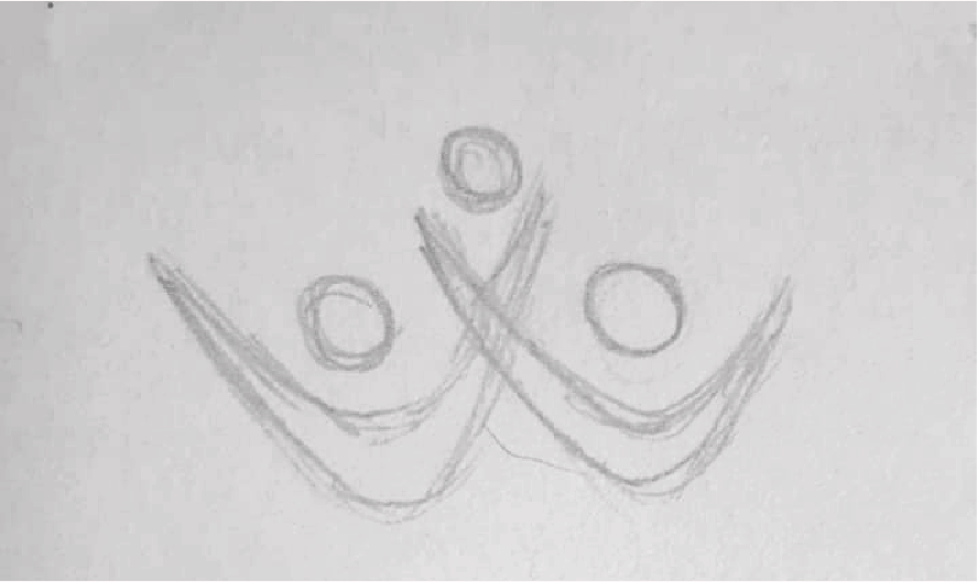
Sketch

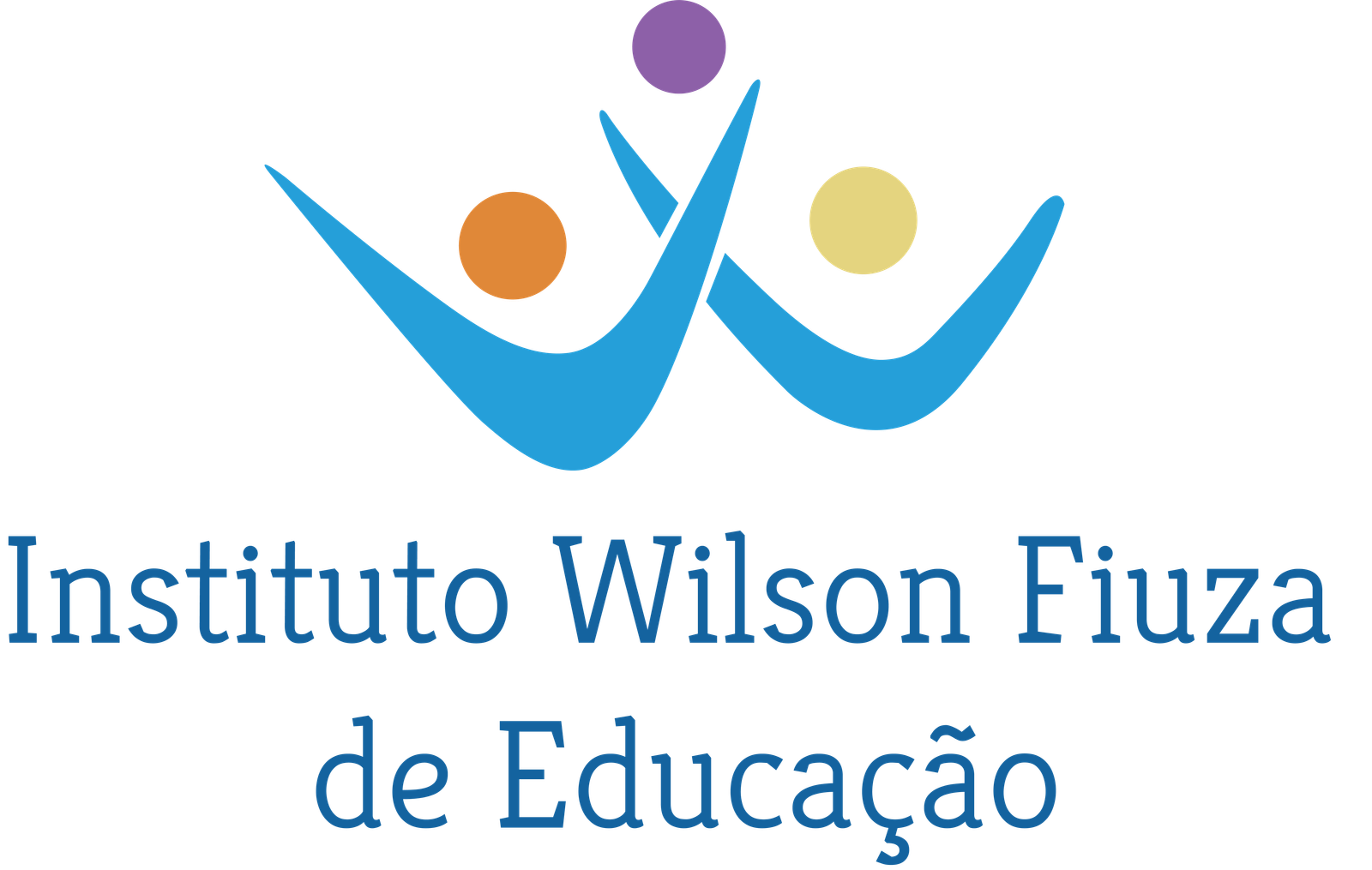
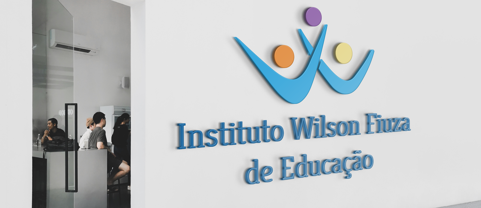
Our logo redesign is more than just a visual facelift – it's a vibrant expression of our institute's essence. The circles symbolize our core objectives: protection, education, and transformation. The two connected blue forms craft a W, embodying unity, while the entire symbol signifies our collective commitment to caring for children.

We opted for the Kreon font with purpose:

  1. It radiates clarity and seriousness, ensuring easy legibility.
  2. As a Google font, it's not only free but also speeds up website loading
Protect- Educate- Transform

New Logo

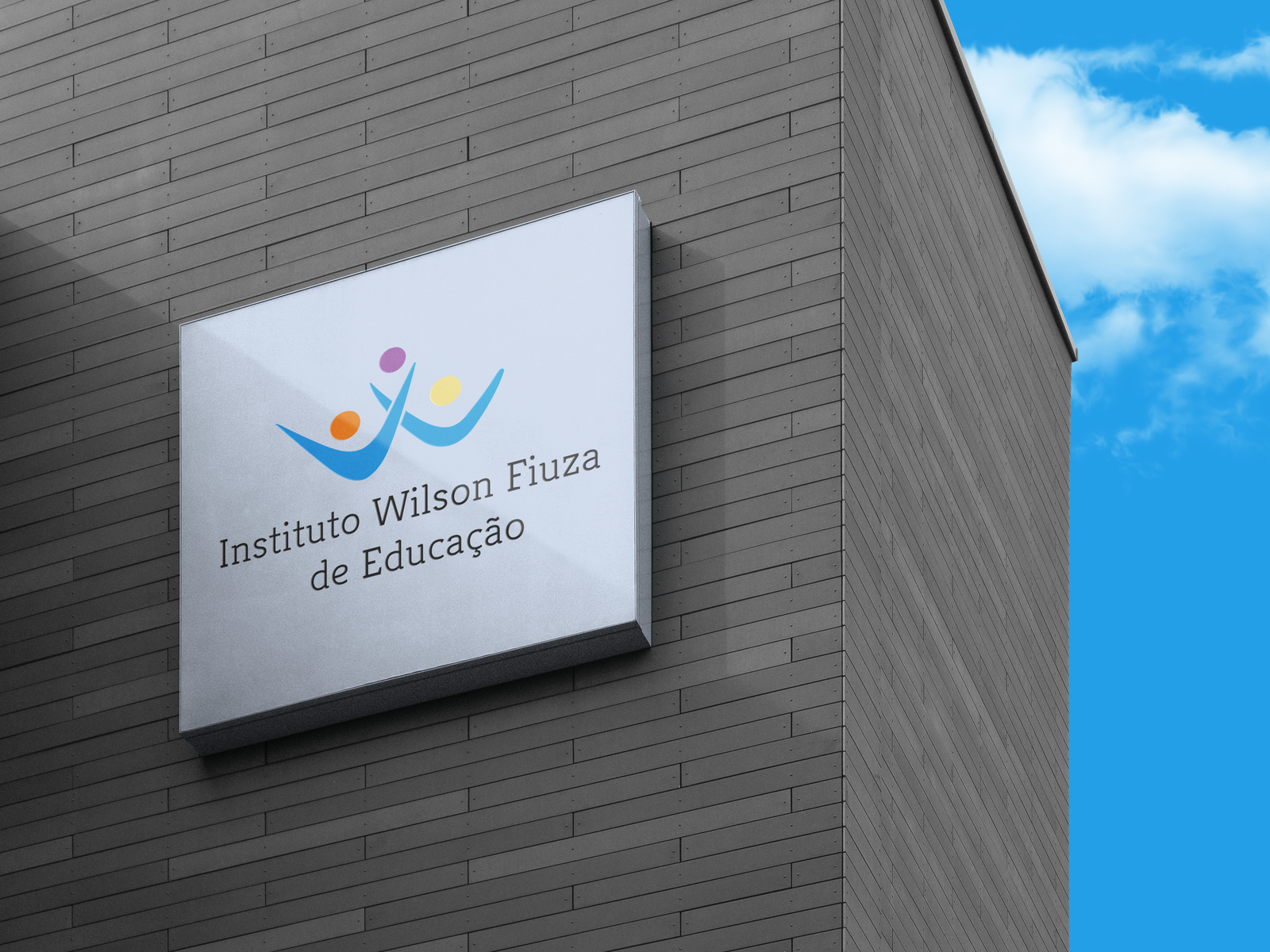
Colors were carefully chosen, not just for their meanings but also for accessibility. High-contrast colors were selected to enhance readability, acknowledging the diverse needs of our audience. This logo is more than an image – it's a thoughtful and inclusive representation of our values and goals. Join us on this visually stunning journey towards positive change!

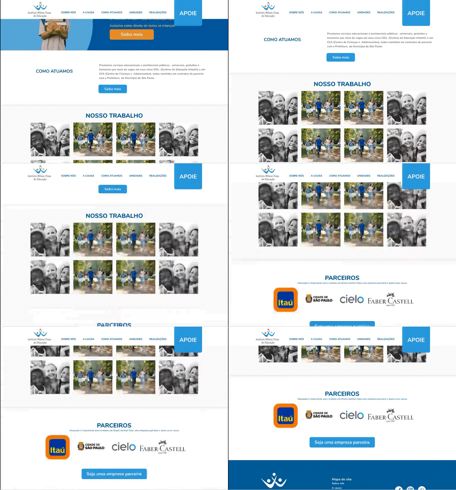
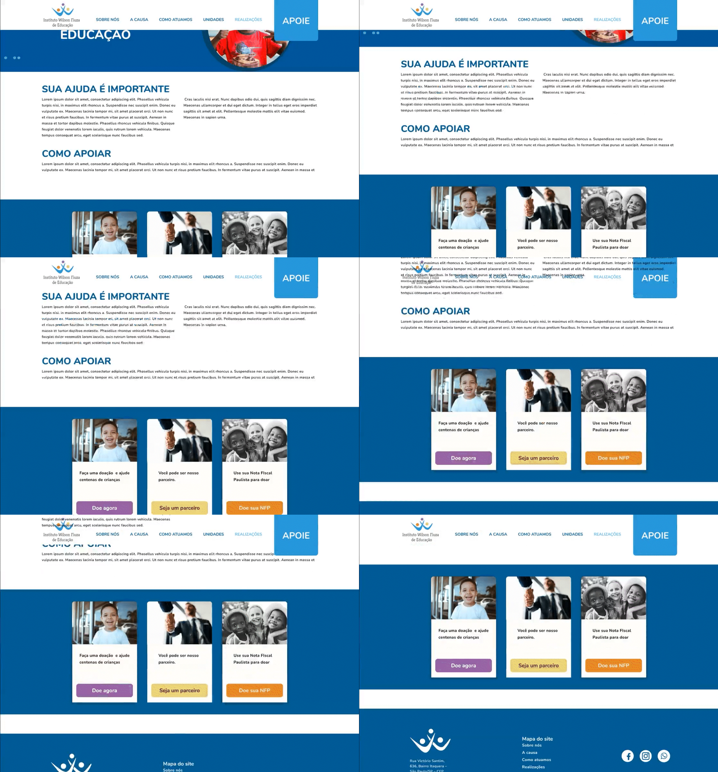
The website was recreated to be more modern and to adhere to the same visual identity.

It includes all the NGO information and the option to donate.

This was volunteer work, and in the end, the company chose not to proceed with the visual identity that was created.

Thank you for scrooling!

I really appreciate you take your time to check my study case! Let's get in touch!