Typography is more than just selecting fonts; it’s a cornerstone of effective design that profoundly impacts how users perceive and interact with your content. From guiding the reader’s eye to conveying your brand’s personality, typography is an essential tool in a designer’s arsenal. Let’s explore why typography matters and how it can elevate your designs with some real-world examples.
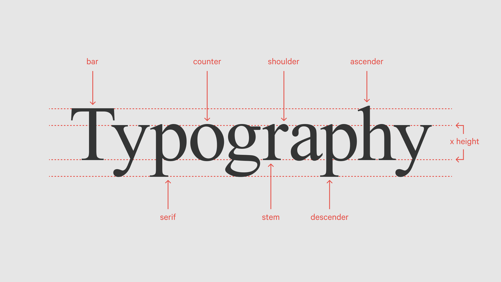
1. Typography Sets the Tone
Typography is a visual voice for your content. The font choices, spacing, and hierarchy create an immediate impression of your brand’s personality. A luxury fashion brand, for instance, might use elegant serif fonts like Baskerville or Didot to evoke sophistication, while a tech startup might prefer a clean sans-serif typeface like Roboto or Helvetica to communicate modernity and simplicity.
Example:
Apple’s use of San Francisco as its system font underscores its minimalist, user-centric brand ethos. The typeface’s clarity and neutrality allow users to focus on the content rather than the design itself.
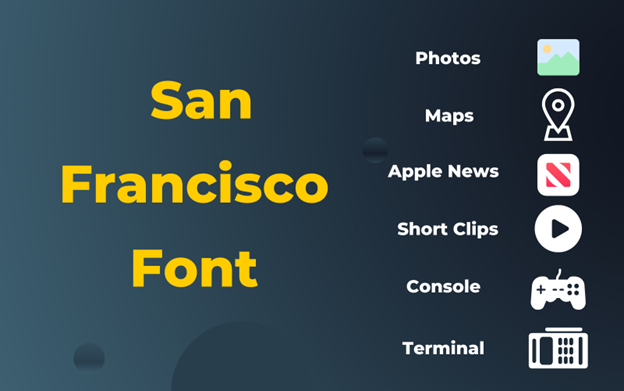 Apple Typography
2. Readability Drives Engagement
Good typography ensures that your content is easy to read and navigate. Poor readability can frustrate users, leading to higher bounce rates and lower engagement.
Example:
Medium, the blogging platform, is celebrated for its impeccable typography. By using a combination of Georgia for its body text and custom sans-serif headers, Medium balances readability with visual appeal, encouraging readers to stay engaged longer.
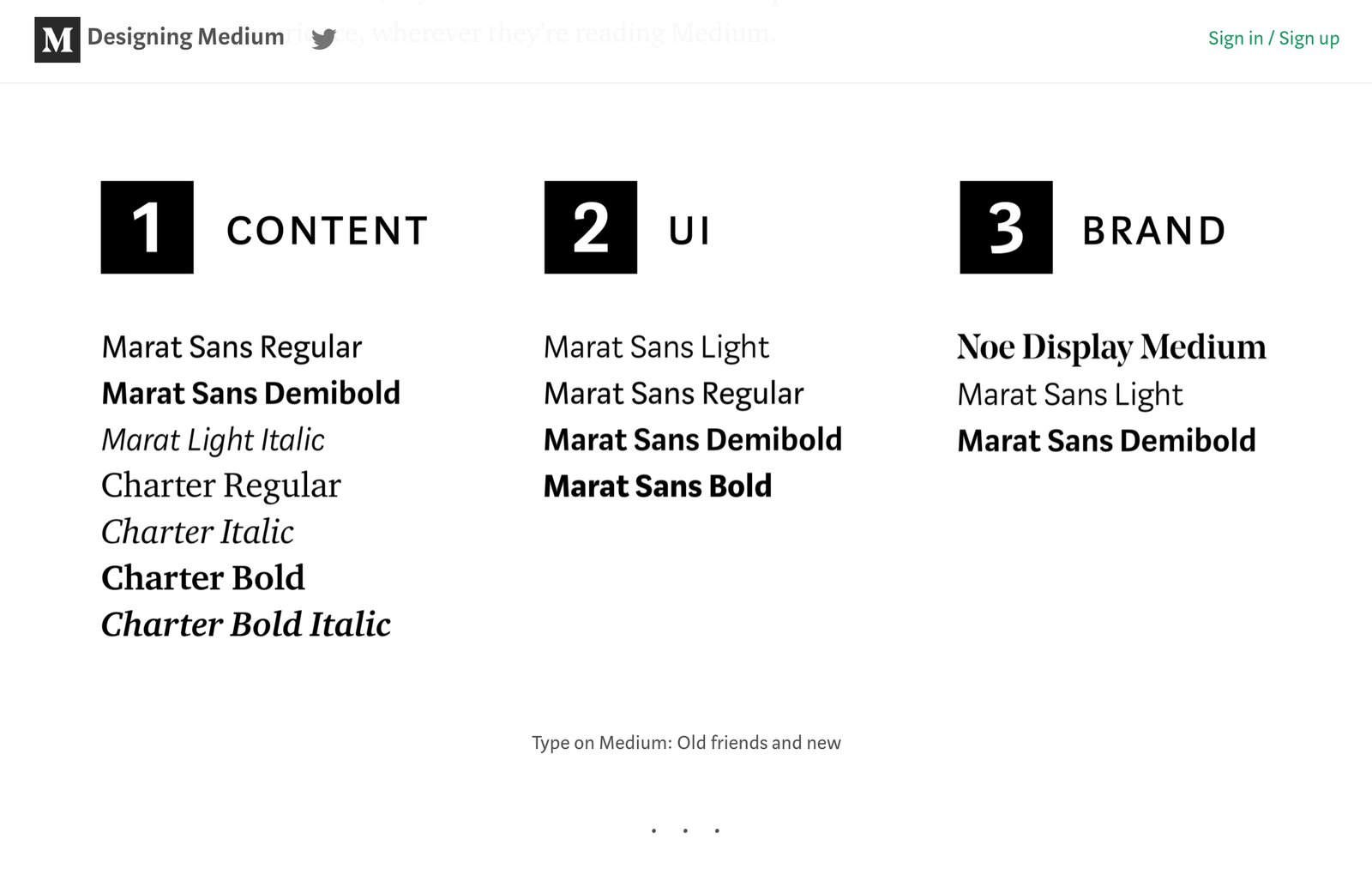 Medium typograph
3. Hierarchy Directs Attention
Visual hierarchy in typography helps prioritize information, guiding users to the most important elements first. This is achieved through font size, weight, and placement.
Example:
Newspapers like The New York Times use bold, large headlines to grab attention, while smaller, lighter text is reserved for body content. This approach helps readers skim for key information quickly.
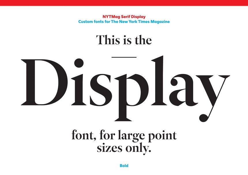 New York Times typograph
4. Consistency Builds Trust
Consistent typography creates a cohesive user experience, building trust and reliability in your brand. Inconsistent fonts and erratic styles can make your design feel unpolished or untrustworthy.
Example:
Google’s Material Design guidelines emphasize consistent typography across platforms and devices. By using the Roboto typeface with standardized font weights and sizes, Google ensures a seamless experience, whether you’re using Gmail or Google Docs.
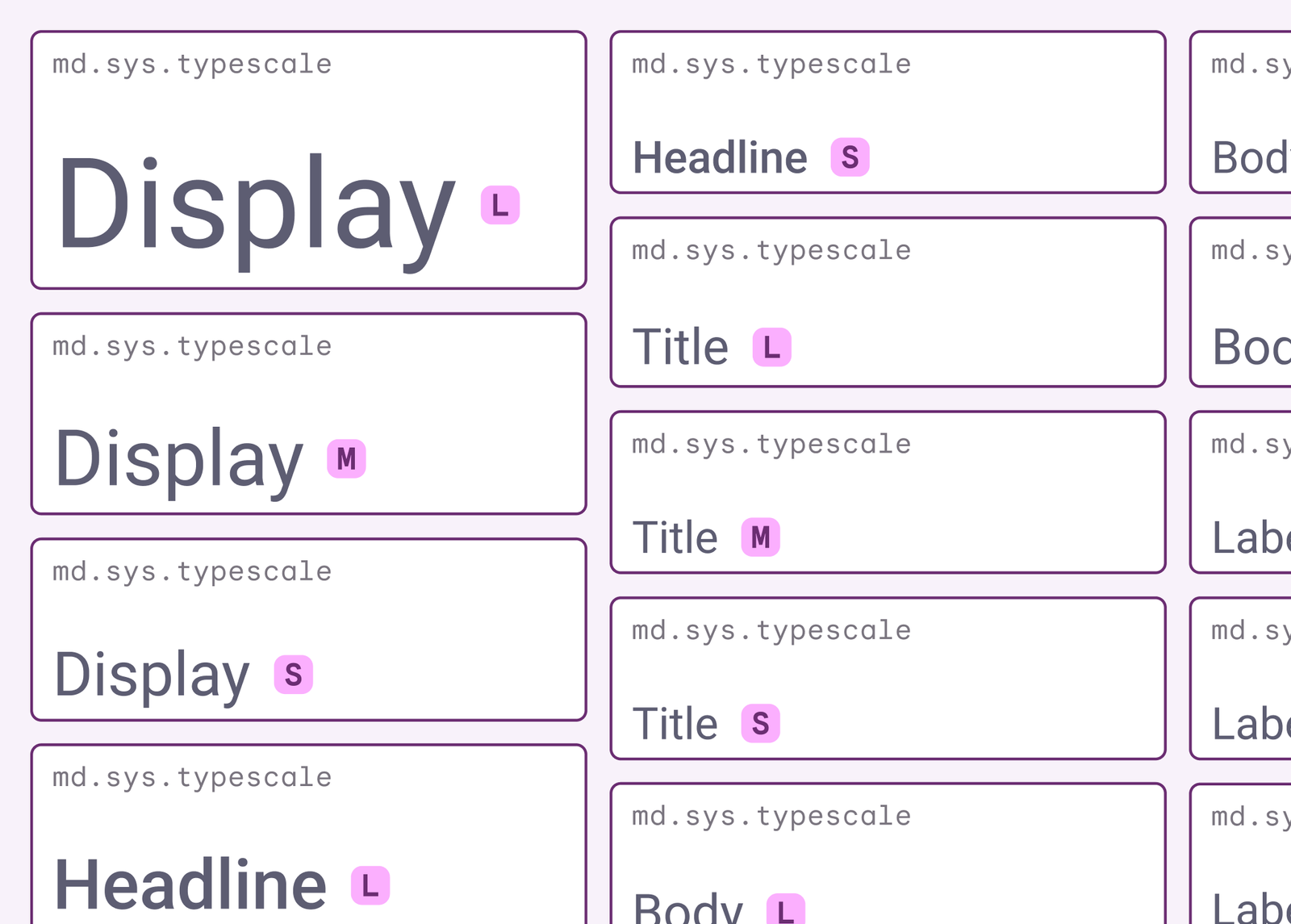 Google Material Design
5. Typography Evokes Emotion
Different typefaces evoke different emotions, shaping how users feel about your content. A playful, handwritten font can feel warm and inviting, while a geometric sans-serif might feel sleek and professional.
Example:
Disney’s branding heavily relies on its iconic typography. The whimsical, hand-drawn feel of the Disney logo typeface evokes nostalgia and magic, perfectly aligning with its brand identity.
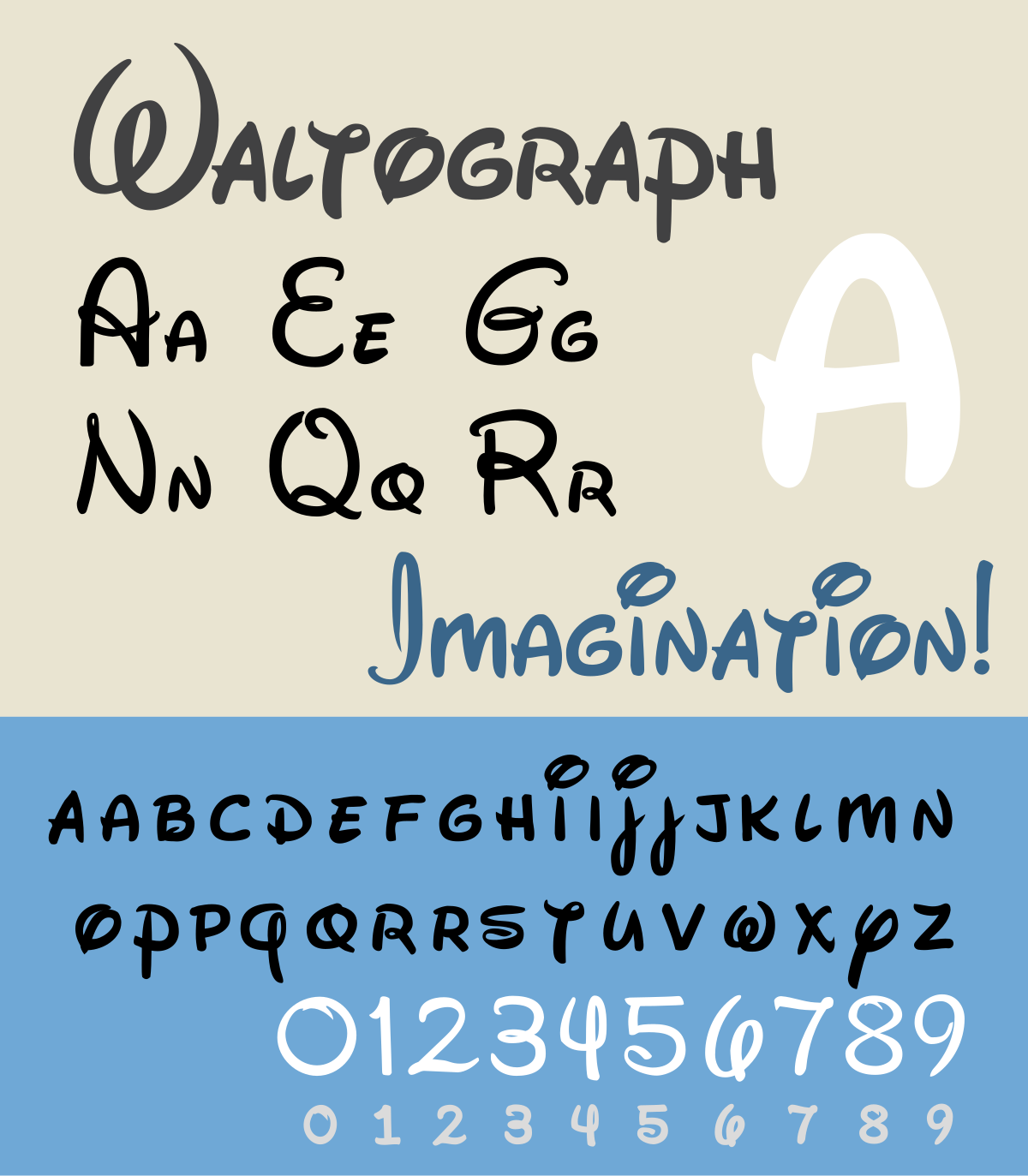 Disney Typograph
Practical Tips for Designers:
- • Fonts Wisely: Limit your design to two or three complementary typefaces to maintain harmony.
- • Mind the Spacing: Adequate line-height (leading) and letter-spacing (tracking) improve readability and aesthetics.
- • Test Across Devices: Ensure your typography looks good and remains legible on different screen sizes.
- • Leverage Contrast: Use font weights and sizes to create a clear distinction between headings, subheadings, and body text.
Conclusion
Typography is a silent yet powerful force in design. It shapes the user experience, communicates your message, and reinforces your brand identity. Whether you’re designing a website, an app, or a printed piece, thoughtful typography can transform your work from ordinary to extraordinary. By prioritizing readability, hierarchy, consistency, and emotional resonance, you can craft designs that truly connect with your audience.