
Your button looks consistent in every Figma file. Then it reaches the browser, and someone cannot activate it with a keyboard.
A component library can organise appearance while leaving behaviour undocumented. The pixels are ready. The interaction is still waiting for its invitation.
An accessible design system helps designers and developers agree on behaviour, meaning and validation.
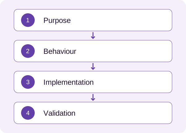
Document purpose before variations
Explain what the component does and when to choose something else. A button performs an action; a link takes someone to a destination. Similar styling does not make their semantics or expected behaviour interchangeable.
Include examples of appropriate use. A gallery of sizes cannot explain whether a destructive action belongs beside a routine one.
Describe meaningful states
Cover relevant default, hover, focus, pressed, selected, unavailable, loading, error and success states.
Explain what changes and what the person should understand. During loading, consider feedback, repeated actions and completion. For an unavailable control, decide how its reason can be discovered.
A grey variant answers a styling question. It may leave “Why can’t I use this?” unanswered.
A reusable documentation template
- Purpose: the task supported.
- Content: labels, instructions and localisation considerations.
- Semantics: the native element or appropriate interaction pattern.
- Keyboard: reaching, activating and leaving the component.
- Focus: its appearance and position after an action.
- Feedback: state changes, messages and announcements.
- Layout: small screens, zoom, long labels and larger text.
- Validation: acceptance checks and relevant user testing.
A simple link and a complex dialog need different levels of detail. Use the template to make decisions visible rather than produce documentation for its own sake.
Example: saving a draft
Consider a “Save draft” button in an illustrative editor. Define its scope: all fields, one section or a local copy?
During saving, communicate progress and prevent accidental duplicate actions when appropriate. Show an accurate confirmation on success. On failure, retain the work and offer a useful retry.
Document a clear accessible name, keyboard operation and visible focus. Specify how meaningful status updates are communicated without repeatedly moving focus away from the editor.
Now the specification describes an experience instead of asking engineering to infer it from a screenshot.
Keep responsibility shared
Design documents intent. Engineering confirms implementation choices and constraints. Accessibility review identifies gaps that design files and automated checks cannot fully capture.
The W3C WCAG techniques provide implementation references. Choose those relevant to the component and verify them in context. Passing individual checks does not establish accessibility for an entire product.
Update documentation and working examples together when behaviour changes. Otherwise, the library can become a very attractive historical document.
Try the form review checklist on a field component. My dashboard case also illustrates why implementation guidance belongs alongside interface design.
Choose one frequently used component this week and add the missing behaviour notes. The next design and development conversation will have a clearer starting point.