
Enterprise AI · Dashboard Redesign
AI Bot Operations Dashboard
Turning scattered bot performance data into an enterprise workspace where teams could see what needed attention and why.
A confidential dashboard redesign for monitoring conversational AI bots across clients and channels. Shown here with anonymized branding and mock data.
- 1 yearproject duration
- ~10moderated test participants
- 1stproduct style guide
- SoloLead UX Designer
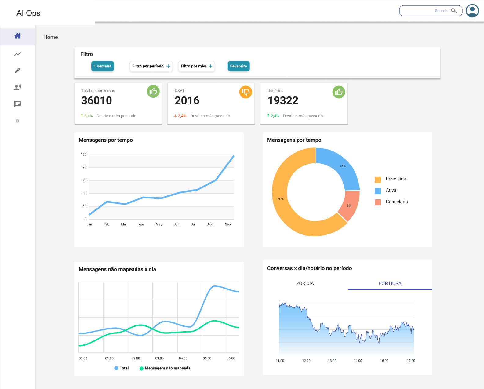 Anonymized screen · mock data
Information architecture · Dashboard UX · Data visualization · Accessibility · Developer handoff
- My contribution
- Sole UX designer; developer collaboration
- Context
- Enterprise conversational AI operations
- Delivered
- Dashboard flows, a 31-page style guide and implementation reviews
01 · Problem
Fragmented data made investigation difficult
Teams needed to monitor conversational AI bots across multiple clients and channels, but the operational picture was fragmented. It was hard to see which bot or channel needed attention, where performance was dropping, which messages were not being understood and what should be investigated first.
As the sole designer, I led the UX structure, dashboard hierarchy, visualization patterns, filters, tables, high-fidelity screens, prototypes and implementation support.
02 · System
A dashboard is only useful when it turns data into the next decision
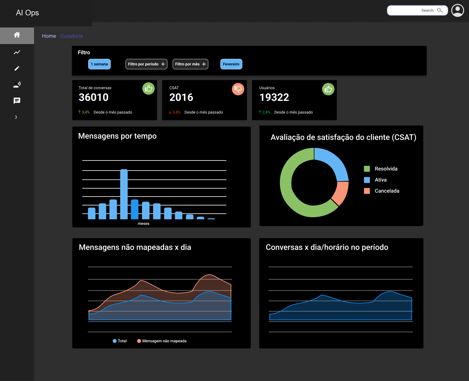
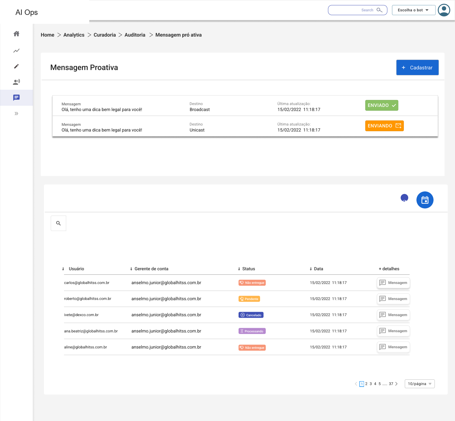
The core design challenge was not simply placing charts on a page. The dashboard needed to help client-facing teams move from signal to investigation: high-level health, performance by channel, unmapped messages, conversation lists, feedback, status and time-based trends.
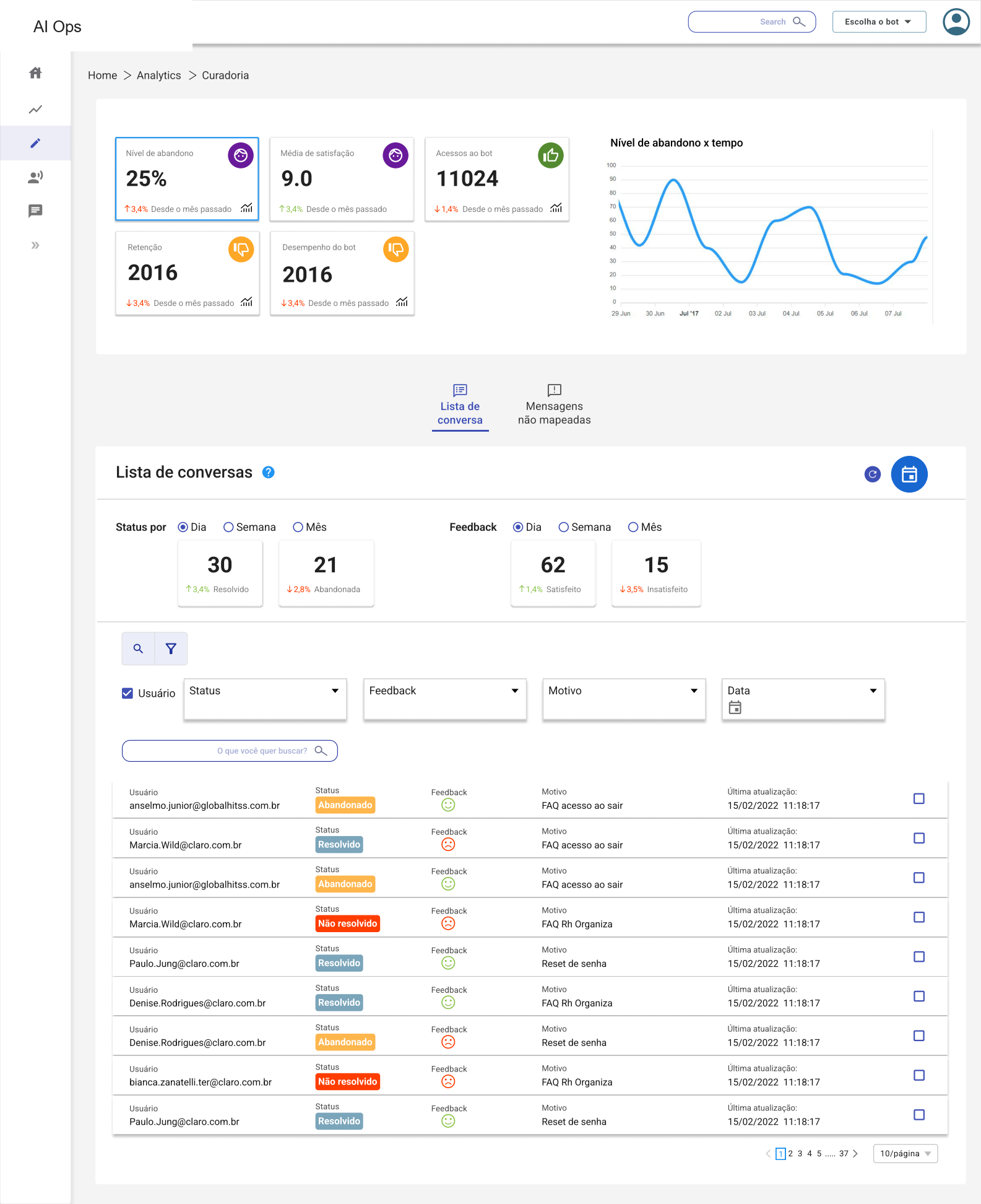
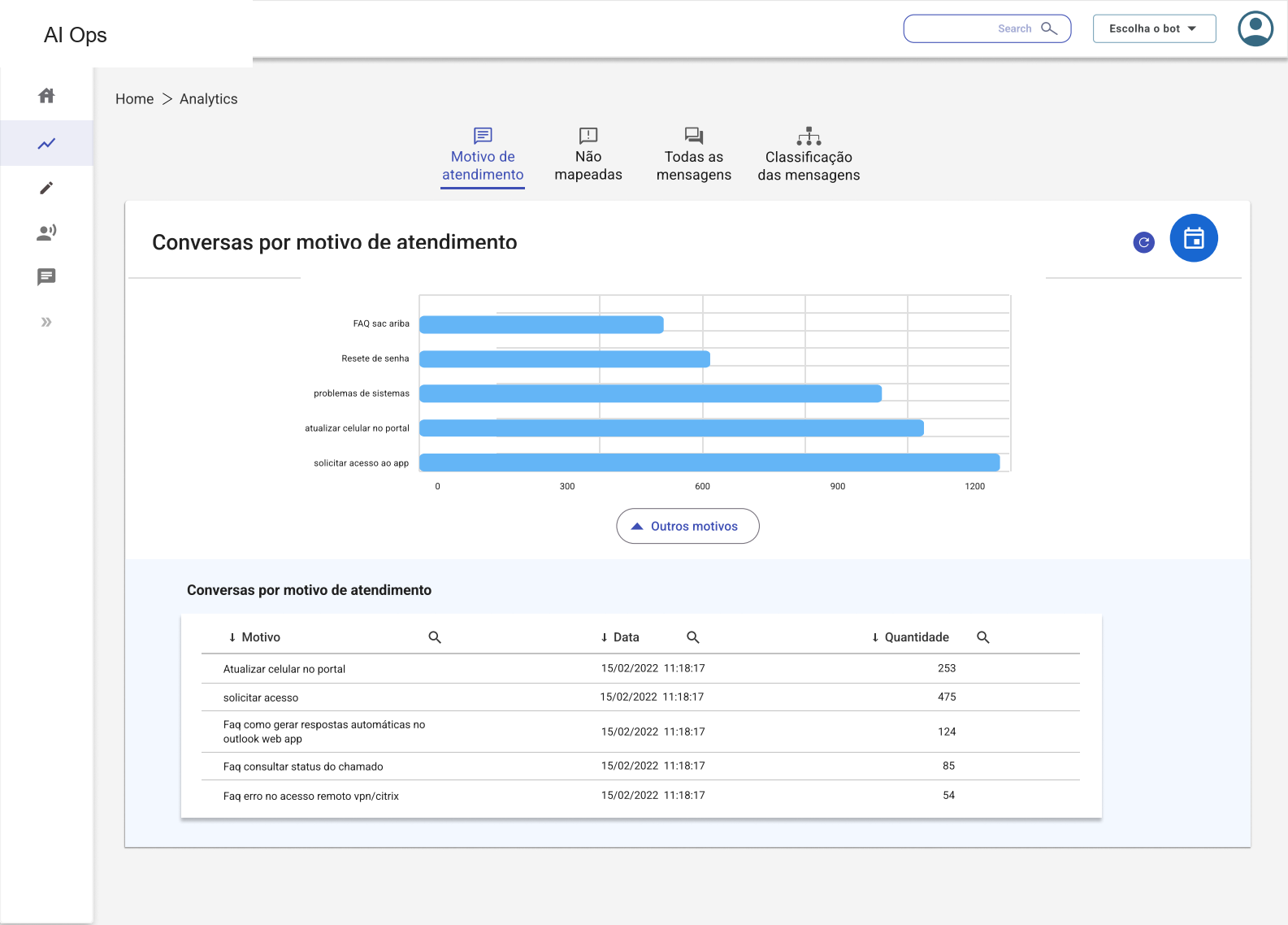
Parts of the dashboard were implemented during my time on the project. I reviewed those screens with developers for consistency with the design.
03 · Decisions
Three design decisions prioritized investigation
Prioritize investigation paths
I organized KPIs, charts and tables so teams could move from summary signals into the messages or channels that needed review.
Make status visible
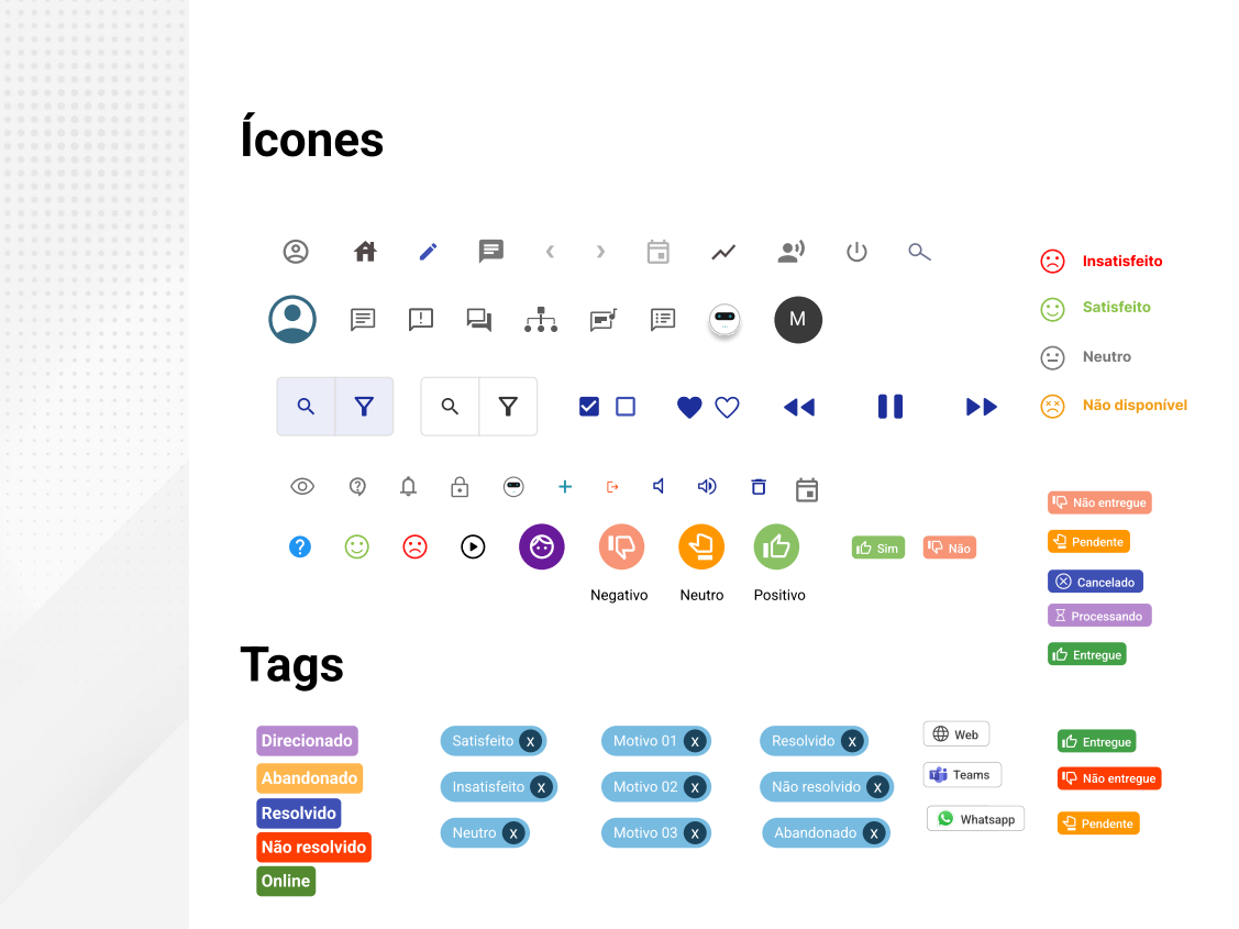
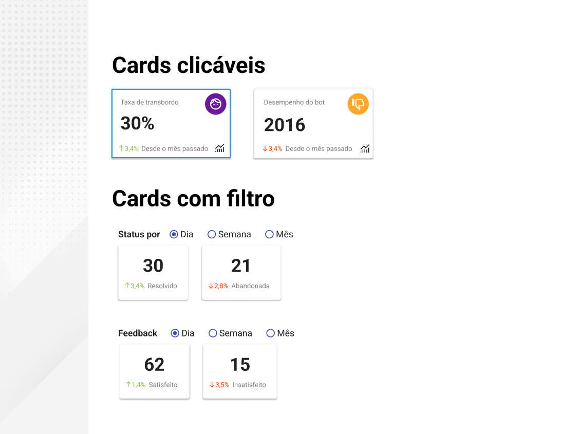
Tags, cards and feedback states made operational conditions easier to scan without relying on dense table reading alone.
Design for implementation
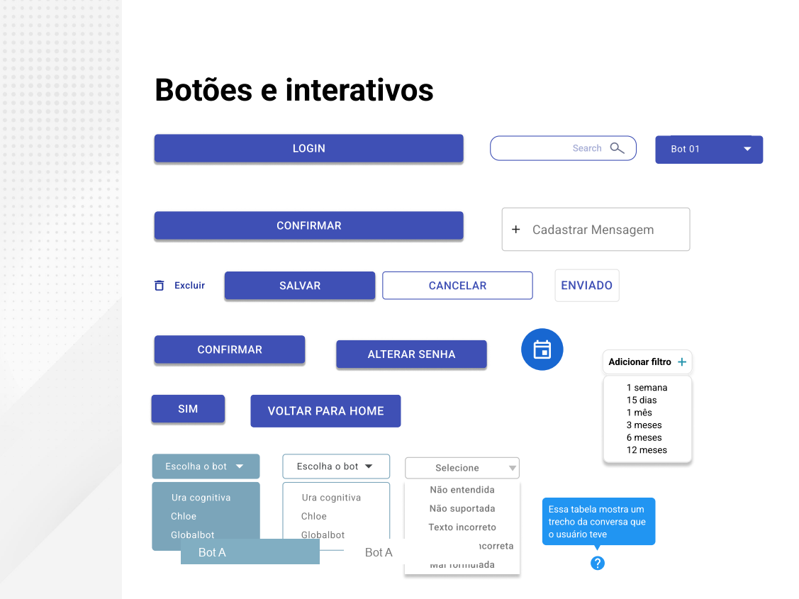
I created the product's first style guide so developers had shared patterns for colors, icons, buttons, filters, navigation and data cards.
04 · Style guide
I created the product's first UI foundation
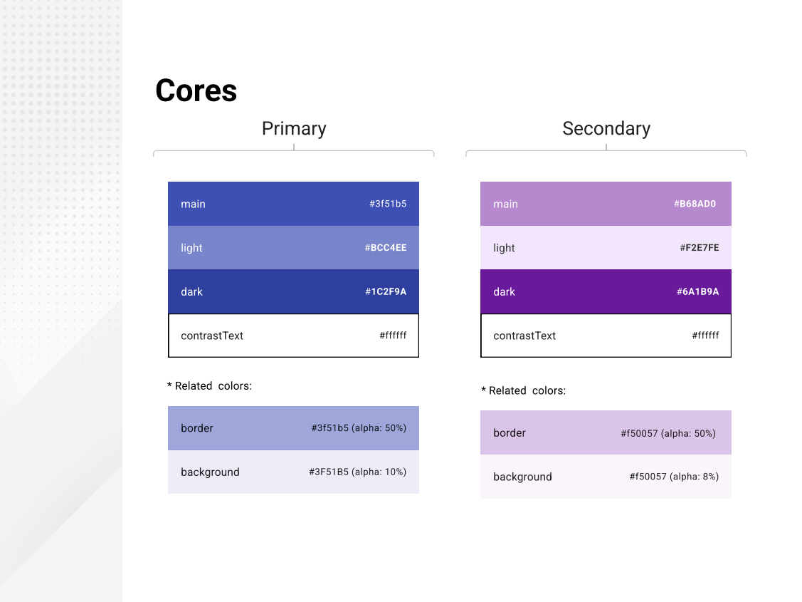
There was no existing design system for this product. I created a style guide covering visual identity, color, status tags, icons, buttons, search, filters, menus, cards and navigation patterns.
The style guide became a shared reference during development and helped reduce doubts and inconsistencies.
05 · Validation
Testing checked whether the structure matched real operational thinking
I moderated task-based testing with around 10 employees who worked directly with clients. They were not the end users of the dashboard, but they understood the client context and helped validate whether the flow made sense for operational work.
One participant described the flow as clearer. That feedback supported the investigation structure; it was a qualitative observation from this test, rather than a measured business outcome.
06 · Implementation
The work continued into developer collaboration
I worked closely with developers throughout the design process, sharing Figma files and interactive prototypes, explaining component behavior and reviewing implemented screens for consistency.
07 · Reflection
Contribution and next steps
This project shows senior product design in a B2B environment: making operational ambiguity easier to act on, creating shared UI foundations from scratch and working with developers to translate design decisions into implemented screens.
- Structured fragmented operational signals into a dashboard organized around monitoring and investigation.
- Created the product's first shared UI foundation so design and development could move with more consistency.
- Balanced evidence, implementation realities and confidentiality limits without overstating product impact.