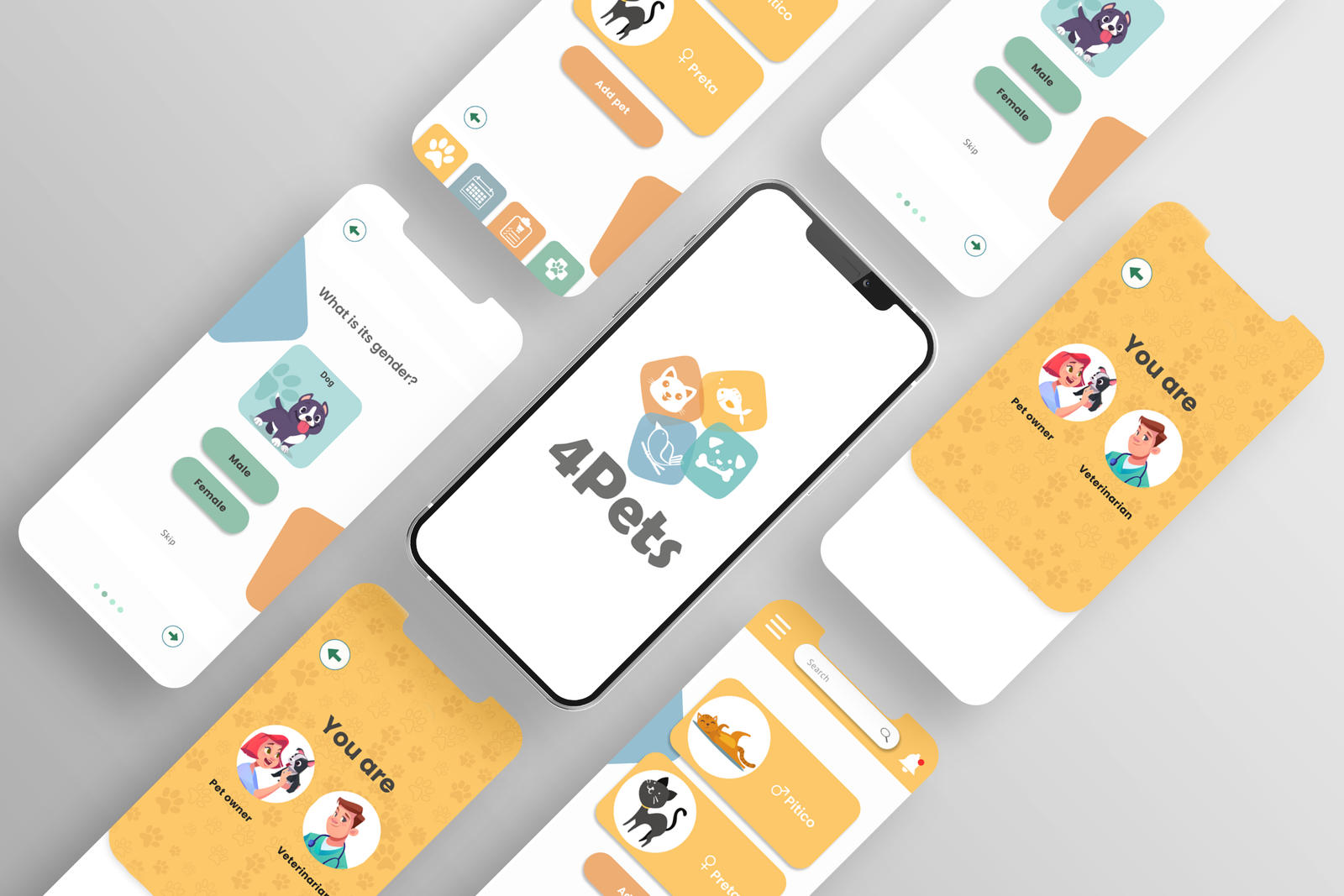
Mobile UX · Pet care routines
4Pets Pet Care App
Designing a mobile experience to help pet owners remember medication, vaccines and recurring care tasks without turning pet health into another scattered calendar.
A product design case focused on routine management, dual audiences and usability testing. The project produced a high-fidelity prototype, not a shipped product.
- 4 monthsproject duration
- 2 audiencespet owners and vets
- Prototypemobile app concept
- Testedcalendar task flow
Product strategy · Mobile UX · Competitive audit · Personas · Usability testing · UI design
- My contribution
- Mobile UX and prototyping
- Context
- Pet care concept and usability study
- Delivered
- Pet care flows, mobile screens and calendar task testing
01 · Challenge
Pet care was a memory problem before it was an interface problem
The initial brief was to design around medication management. I reframed the opportunity around pet care routines: vaccines, medication, feeding schedules, vet information and the small recurring tasks that are easy to forget until they become urgent.
The goal was to support pet owners with reminders and centralized information while exploring how veterinarians could share guidance and reduce repetitive support requests.
02 · Product Framing
I separated the product into two connected jobs
Remember and act
Pet owners needed a place to track medication, vaccines and practical information without relying on memory, notes or a generic calendar.
Guide and reduce repetition
Veterinarians needed a clearer way to share instructions, answer common questions and keep pet health information easier to access.
03 · Research
The market scan showed a feature-rich category with room for clearer focus
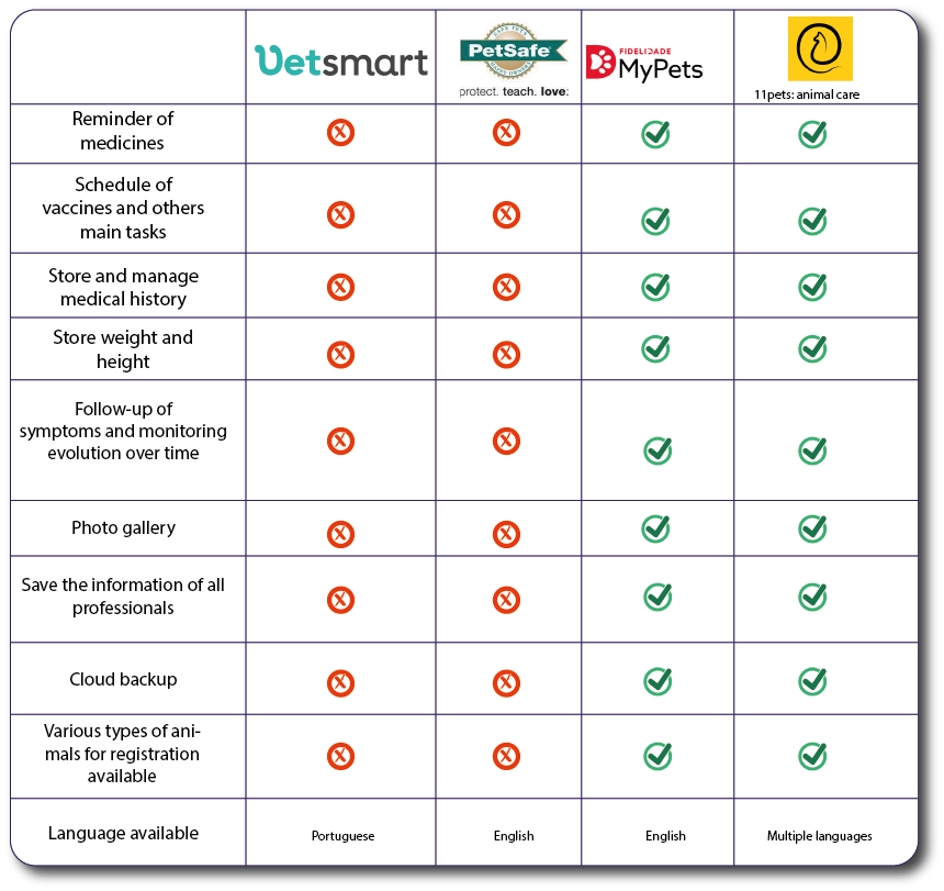
I compared pet care apps across core capabilities such as medication reminders, vaccine schedules, medical history, professional information, backup and animal types. The audit helped define which features were table stakes and where 4Pets needed a clearer experience.
04 · Personas
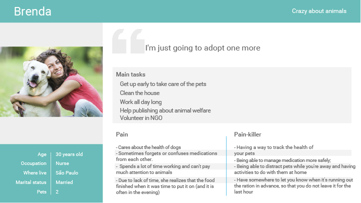
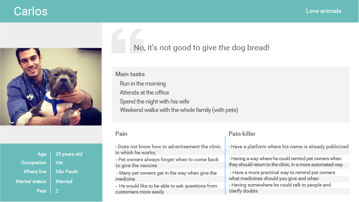
The personas made the product tension visible
Brenda represented the owner side: remembering care tasks while juggling work and multiple pets. Carlos represented the veterinarian side: needing a scalable way to keep owners informed without answering the same questions repeatedly.
05 · Design Direction
The interface used friendly visuals, but the structure stayed practical
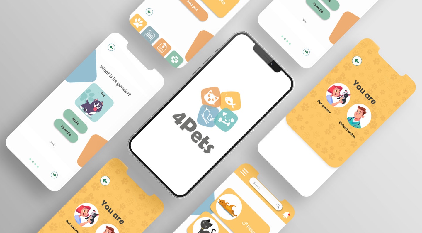
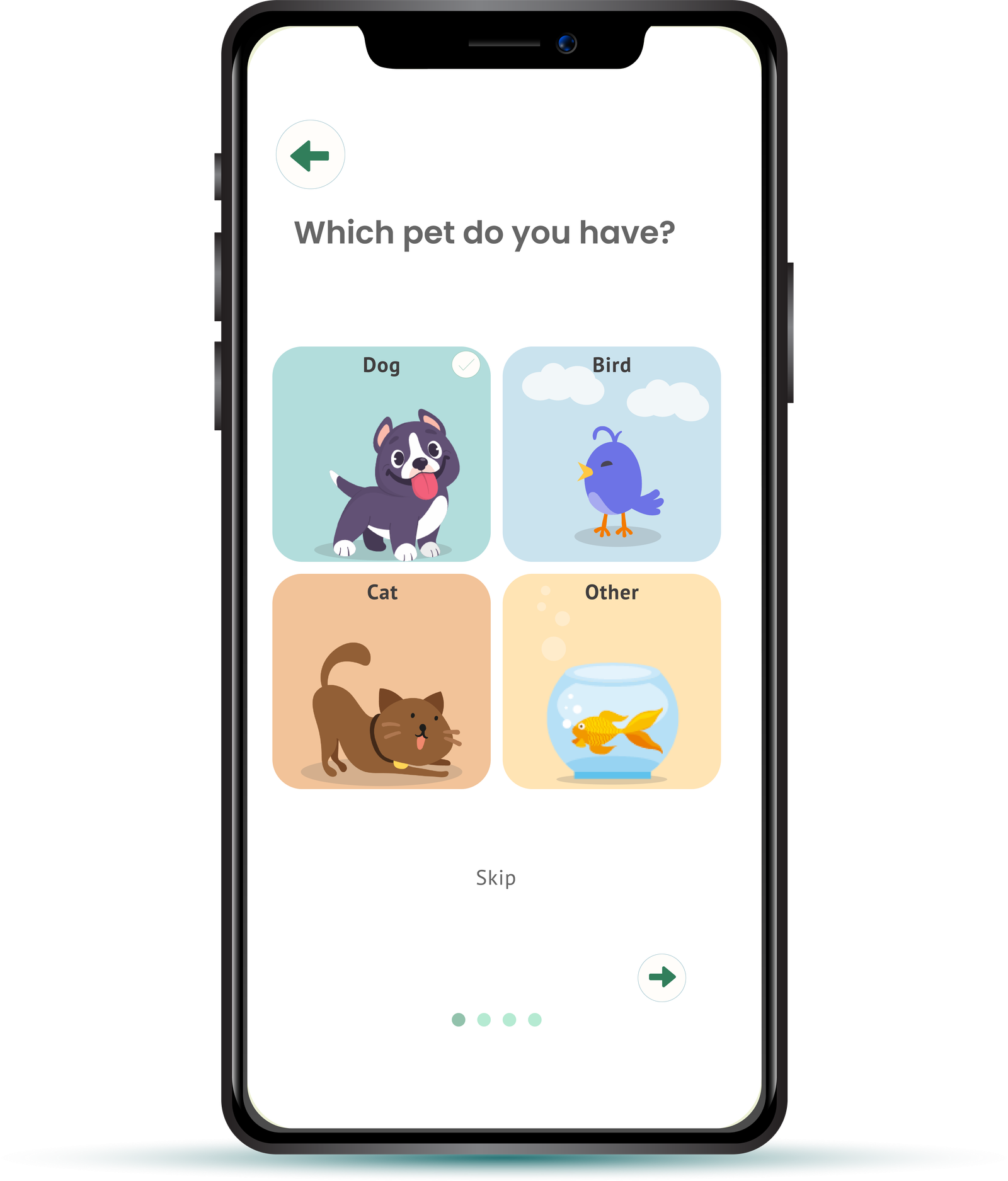
The visual system was intentionally warm and approachable, but the UX priorities were operational: choosing a pet, storing health details, accessing schedules and adding reminders quickly.
- Use animal categories to make onboarding feel immediate and low effort.
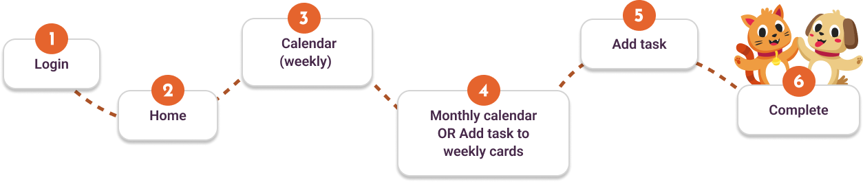
- Keep the calendar and add-task flow close to the home experience.
- Use color and illustration to support recognition, not to hide weak navigation.
06 · Usability Test
The prototype was tested around the routine that carried the most product risk
The test asked participants to find the calendar and add a task, such as a medication or food reminder. That flow mattered because reminders were the core behavior the product needed to make easier.
07 · What Changed
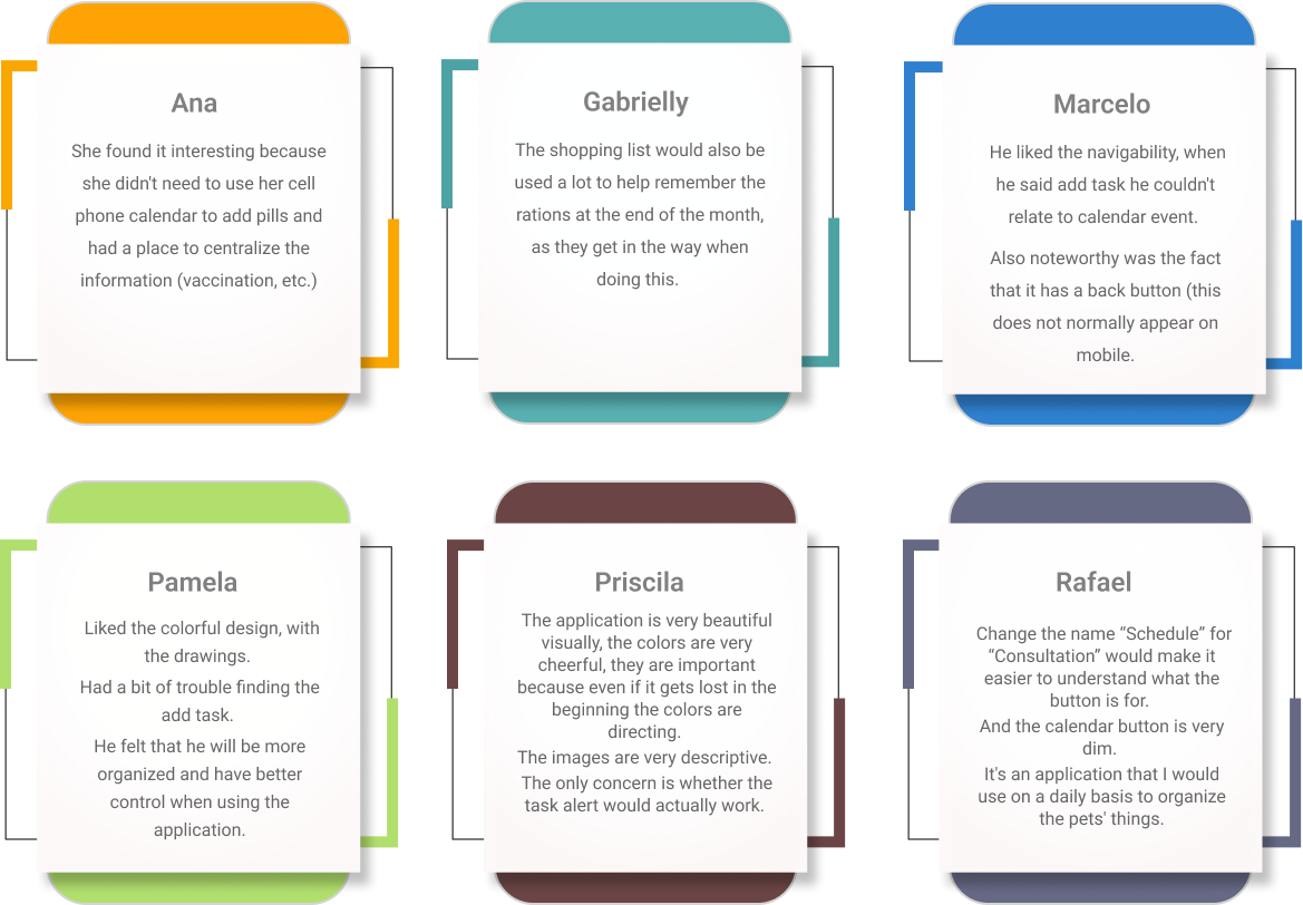
The test pointed to three product decisions
Make reminders more explicit
Users valued reminders, but the path to adding tasks needed to read more clearly as a calendar action.
Protect orientation
Back navigation and clear labels mattered because users used them to recover when they felt unsure.
Keep the system daily-use friendly
Participants responded to organization, color and centralization as reasons they could imagine using it often.
08 · Reflection
Contribution and next steps
4Pets shows how I translate a broad concept into product structure: defining audiences, mapping routine behaviors, prototyping a mobile flow and using usability feedback to make the next design decision clearer.
- Moved from a medication-reminder brief to a broader pet care routine system.
- Balanced emotional brand cues with practical task completion.
- Used the calendar task study to identify the next iteration of the mobile prototype.