0→1 Product Case Study
Nebula
A reading adventure for children, balancing children’s motivation with parents’ need for visibility.
Nebula is a self-initiated 0-to-1 product: part story world, part reading system, shaped by parent research, tested with children aged 6–11 and developed into a coded, navigable prototype.
- 455survey responses
- 10parent interviews
- 2testing rounds
- 22coded routes
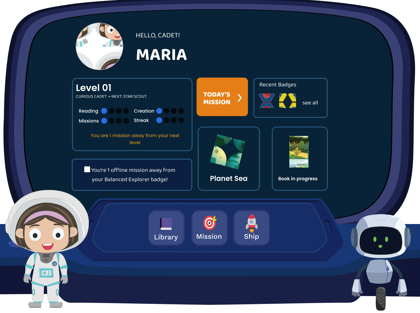 Coded prototype
Product direction · Research · UX/UI · Usability testing · Front-end prototype
- My contribution
- Independent product design
- Context
- Self-initiated reading experience
- Delivered
- Research, child usability studies and a coded prototype
01 · Problem & evidence
A small universe with a real product problem

Children
Children needed a reason to return that felt less like homework and more like a journey.
Parents
Parents wanted reassurance without turning reading into another thing to police.
Build a playful reading world children would want to revisit, while giving parents enough visibility to support progress confidently.
Self-initiated and led end to end across product direction, research, UX/UI, usability testing and front-end prototyping.
Evidence shaped the product direction
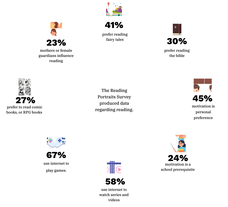
455responses in 2020
- 42responses in 2021
- 10parent interviews
- 2usability rounds
What the evidence revealed
- Motivation to read was personal, not generic.
- Entertainment strongly competed for children's attention.
- Parents wanted reassurance and visibility into progress.
How it shaped the product
-
Make reading feel like exploration
Use a playful product world to create motivation and continuity.
-
Reduce friction for young readers
Use visual cues, clear paths and less dense text.
-
Keep parents meaningfully informed
Parents wanted reassurance and clearer visibility into progress.
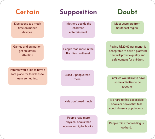
Known
Parents wanted visibility into reading progress; children needed a stronger reason to keep reading.
Assumed
An adventure framing would sustain motivation for longer than a rewards or streak mechanic alone.
Needed validation
Whether icon-led navigation would be clear to children without supporting text — tested later with children.
Survey results from the 2020 parent research and the CSD matrix used to separate assumptions before prioritization.
02 · System & trade-off
One product, two connected experiences
Nebula had to serve two audiences without flattening either one. Children needed wonder, momentum and low-friction reading. Parents needed reassurance, progress visibility and a sense that the experience was meaningful. I designed and programmed the product as a shared reading ecosystem with distinct child and grown-up experiences.
Child experience in full: role selection, onboarding, personalization, dashboard, library, reading, missions, achievements, profile, universe and world exploration. Grown-up experience in full: role selection, authentication, dashboard, kids, explorers, settings.
The routes confirm that both experiences were programmed. Different areas remain at different levels of completeness and visual fidelity.
The central product trade-off
The two audiences did not just have different needs — they pulled the product in opposite directions. Resolving that tension, rather than picking a side, was the core design decision.
Immersion for children
A world children want to stay inside — playful language, illustration-led navigation, minimal friction between wanting to read and reading.
Visibility for parents
Enough visibility to feel reassured about progress, without turning the child's experience into something that feels monitored.
Direction: protect the child's sense of adventure while giving grown-ups a separate, calmer view of progress.
03 · Decisions
Three product decisions
Each decision connects a research observation to the interface response and the next question to test.

01 · Motivation
Adventure-based onboarding
Reframing onboarding through travel and discovery kept motivation inside the story world.
Evidence: Visible in the coded onboarding.
Boundary: Not tested as an isolated hypothesis.

02 · Navigation
Visual-first navigation
I used illustration and visual cues to reduce dependence on dense text.
Evidence: Visible in the exploration experience and informed by testing.
Boundary: Testing also showed that icons still needed explanation.

03 · Dual audience
One direction, two audiences
The child's reading journey and parents' need for visibility shaped one connected product direction.
Evidence: Supported by parent interviews and survey findings.
Boundary: The grown-up routes are programmed but still need navigation, data and visual fidelity to be verified.
04 · Testing
Testing changed the design
Nebula was tested twice with children aged 6–11. Each moderated round was tied to a specific prototype stage.
Round 1 — low-fidelity prototype
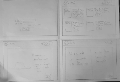
BeforeSign-in, icons and plan visibility were untested assumptions.
What children revealedChildren needed a simpler sign-in flow, clearer icons and easier access to plans.
Design directionSimplify entry, add explanation and improve plan visibility.
Round 2 — refined high-fidelity prototype Proposed next iteration
BeforeRound 1's direction carried forward, but hierarchy and progression were still unvalidated.
What children revealedThe visual hierarchy needed stronger contrast, and levels were not self-explanatory.
Design directionIncrease contrast and explain progression more clearly. These changes still need another test round.
Across both rounds, the pattern was consistent: a more visual interface was not automatically more accessible. Icons needed explanation, contrast needed stronger hierarchy, and progression needed clearer language. The next step is to re-test those fixes with children.


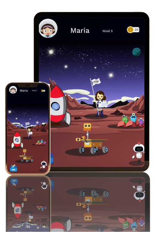
Five screens from the coded prototype: dashboard and progress, exploration, a guided reading prompt, the library and missions.
- Choose the experience
- Enter the world
- Meet the guides
- Personalize the journey
- Mission ready
- Return, explore and read
06 · Reflection
Would I build the same product today?
Nebula taught me that a playful interface is not automatically an accessible one. A delightful universe can still confuse a child. Clear labels, contrast and understandable progression mattered as much as visual engagement.
- Validate the adventure-language hypothesis on its own, separate from onboarding.
- Re-test the Round 2 contrast and progression changes with children before treating them as solved.
- Audit the grown-up experience in more detail — the routes are programmed, but navigation, data behavior and visual fidelity still need to be verified.
This project documents how I took an ambiguous problem — a tension between two audiences with no obvious resolution — and turned it into a defensible product direction through independent research, design and prototyping. It also shows where research-backed decisions and testing observations should have pushed harder than visual polish, and where a coded prototype surfaced questions that static screens would have hidden.