
Conversational AI · Product Architecture
AI Companion Experience
Reorganizing an early conversational AI product so people could understand the offer, the access rules and the path forward.
A confidential case about a GPT-based product with chat, voice, prompts, personas, account states, credits and subscription rules. Shown here with anonymized branding.
- Lead UXproduct structure and visual system
- Web + mobileresponsive experience mapped
- Research planprepared before interviews
- Style guideshared UI foundation
Product architecture · Conversational AI · Responsive UX · Design systems · Research strategy
- My contribution
- UX and product architecture
- Context
- Confidential early-stage AI product
- Delivered
- Responsive flows, account states and a qualitative research plan
01 · Problem
The product had more capability than product clarity
The platform already had a rich feature set: users could ask questions, hear answers spoken aloud, explore prompts, use or create personas, save conversations, move between free and premium access and manage a credit system. The challenge was that these rules and paths were difficult to understand as one coherent experience.
My work focused on clearer navigation, account states, responsive flows, reusable UI patterns and a research plan the team could use in a later validation phase.
02 · Architecture
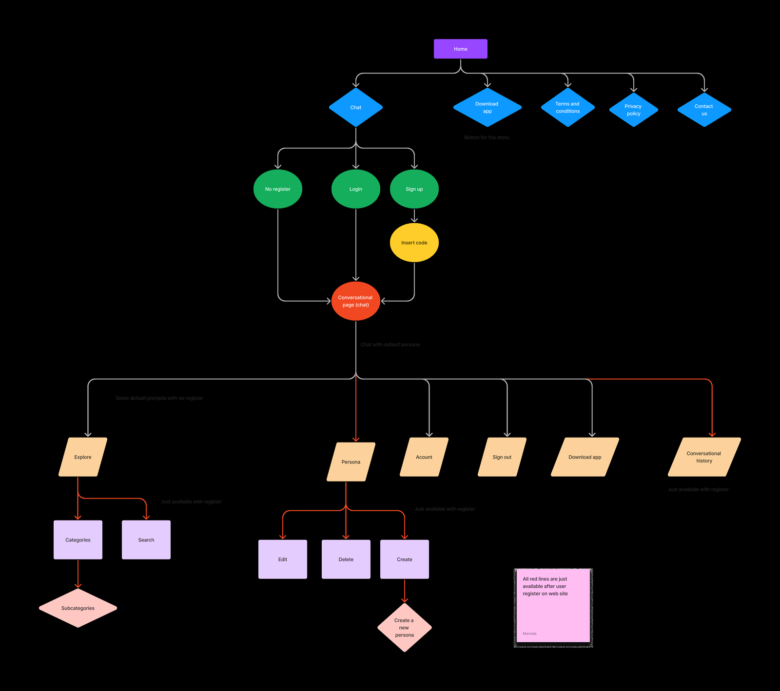
I mapped the product as a system of access states
A central product decision was to separate what people could do before creating an account, after registering and after subscribing. That made the chat, prompt library, personas, conversation history and credit limits easier to explain across platforms.
03 · Decisions
Three decisions structured entry, access and navigation
Make entry points visible
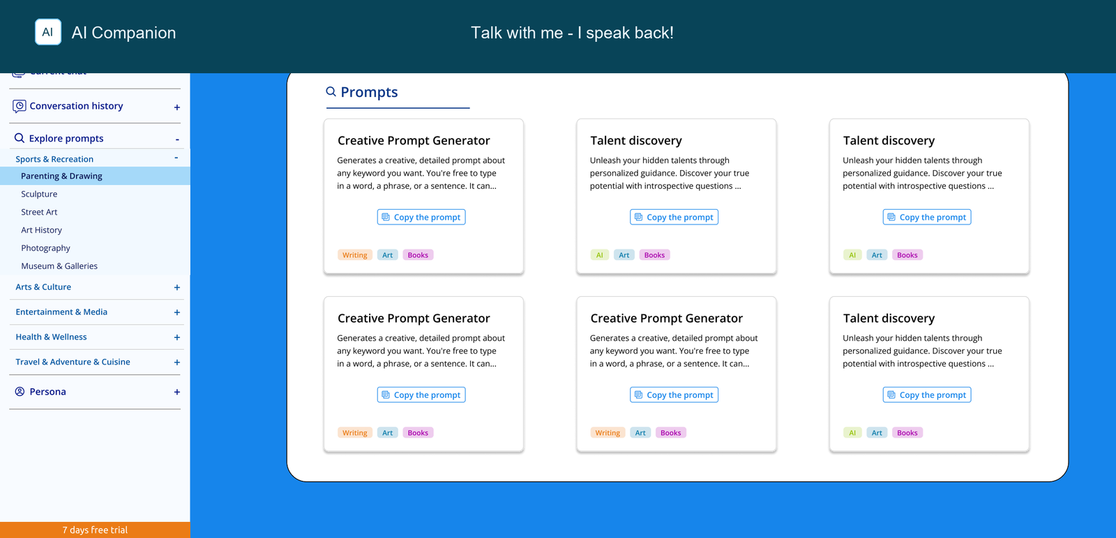
I organized the experience around clear destinations: chat, prompt exploration, conversation history, personas, profile and account rules.
Explain access before friction
Free use, registration, trial, credits and subscription needed to be understandable before people reached a blocked action.
Design one system across devices
Desktop and mobile needed shared patterns for navigation, controls, prompts, voice and account states without forcing the same layout everywhere.
04 · Responsive UX
The same product logic had to work in very different spaces
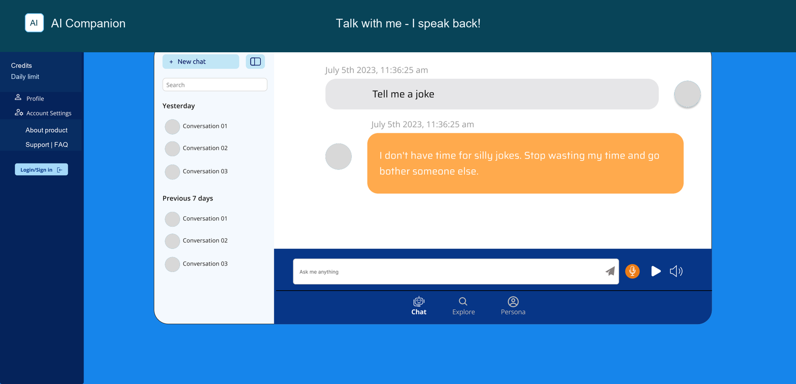
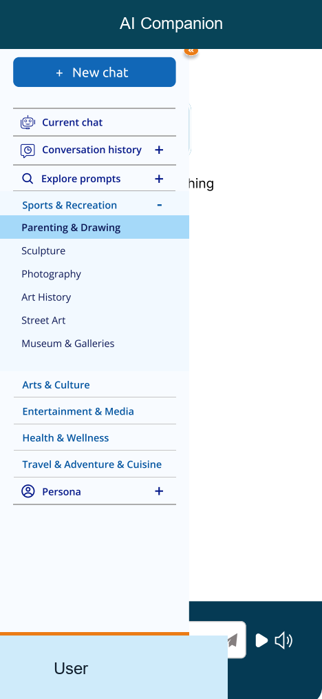
The desktop experience had more room to expose navigation and prompt categories. Mobile required tighter hierarchy, clearer menu states and controls that stayed reachable while people were typing, listening or exploring.
05 · UI foundation
Shared UI patterns supported consistency across screens
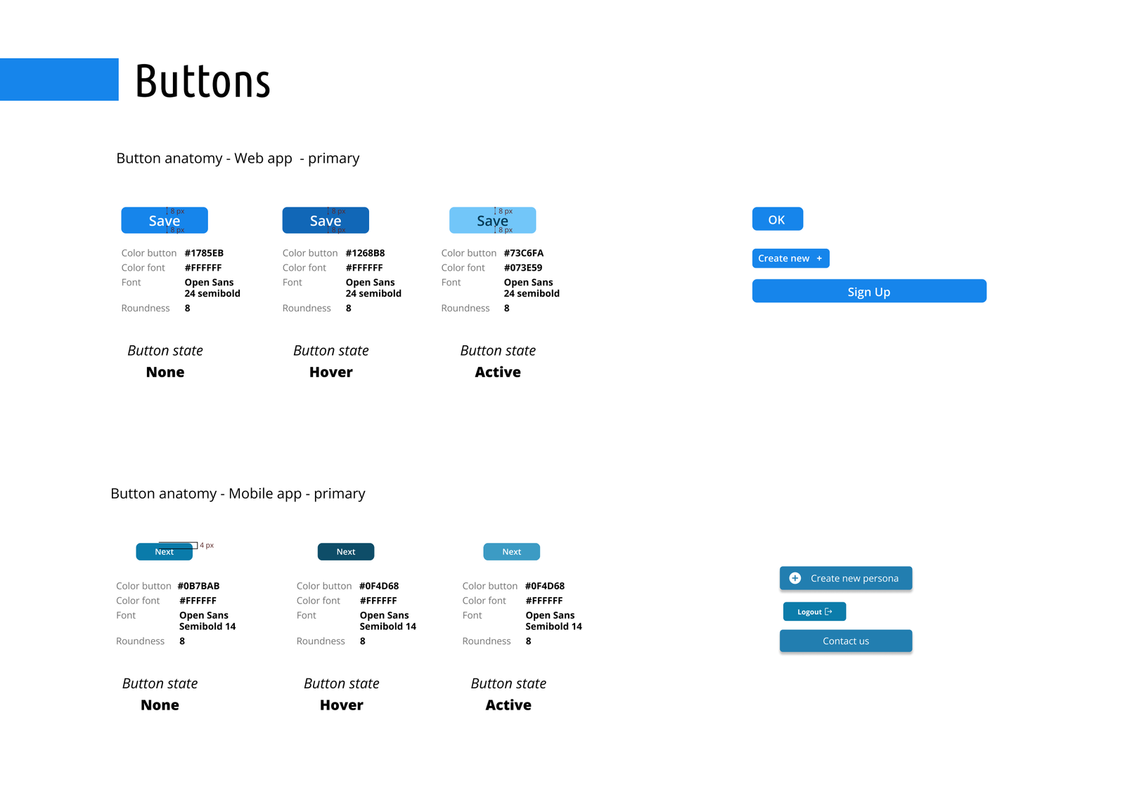
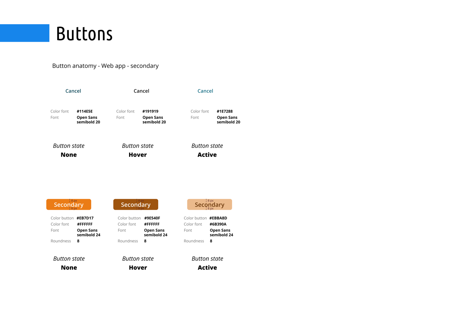
I created shared patterns for buttons, forms, colors and interaction states so the product could move beyond one-off screens. This mattered because the experience included many repeated states: chat, login, registration, trial, subscription, profile, prompts and persona settings.
The style guide documented recurring components and states as a shared reference for an evolving product.
06 · Research strategy
The research plan was ready, but interviews had not started before I left
I created the research strategy for qualitative interviews: objectives, participant profiles, recruitment criteria, interview script and team responsibilities. The plan targeted people with different levels of AI familiarity, including frequent AI users, tech professionals, older adults with lower digital confidence and people curious about voice access to conversational AI.
The participant profiles were recruitment hypotheses. Interviews had not started before I left, so validating those assumptions remained the next step.
07 · States
Credits and subscription rules were part of the UX, not just the business model
The credit system affected what people could try, save and continue. Designing those rules meant making limits visible without turning the product into a maze of blocked actions.
Try without an account
People could experience the chat with a daily credit limit, but could not save personas, prompts or history.
Register without subscribing
Registration unlocked continuity, while reduced credits still made the access model visible.
Subscribe for expanded access
Subscription changed the credit limit and needed to explain value without hiding the trial conditions.
08 · Reflection
Contribution and next steps
This case documents product architecture for an early AI product: making a large set of features, rules and monetization states into a coherent product model. Research validation remained the next step.
- Structured chat, prompts, personas, voice and account states into a more coherent product model.
- Designed across web and mobile instead of treating responsiveness as a late-stage resize exercise.
- Framed research honestly: strategy and preparation completed, interviews not completed before the engagement ended.