
UX Research · Accessible Banking
Inclusive Digital Banking for Older Adults
Understanding why older adults hesitate to use banking apps, and what a clearer, safer digital experience would need to support.
A UX research and strategy project exploring banking experiences for adults aged 55-80. No final interactive prototype was developed.
- 73survey responses
- 40within target age group
- 55-80target audience
- Researchstrategy and recommendations
Desk research · Survey design · Interviews · Personas · Accessibility recommendations
- My contribution
- UX research and accessibility strategy
- Context
- Banking research with adults aged 55–80
- Delivered
- Research synthesis, personas and recommendations
01 · Challenge
Banking apps were useful, but trust was fragile
Many older adults in the study described banking apps as confusing, difficult to navigate and risky to use without support. The project explored what made people hesitate and what would make digital banking feel more trustworthy.
This is a research and strategy case. It produced insights, personas, journeys, benchmark analysis and recommendations, but it did not produce a tested product prototype.
02 · Method
The study combined desk research, survey data and interviews
Desk research
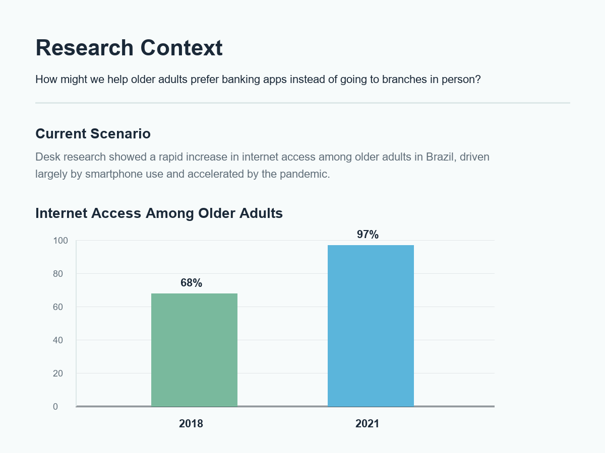
Official sources and market references helped frame the growth of smartphone and banking app use among older adults.
Quantitative survey
A 20-question survey gathered 73 responses, including 40 respondents within the 55-80 target group.
Qualitative interviews
Interviews with older adults explored fears, support needs, language barriers and real experiences with banking apps.
03 · Artifacts
Personas helped make different levels of digital confidence visible
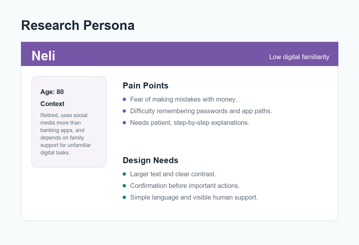
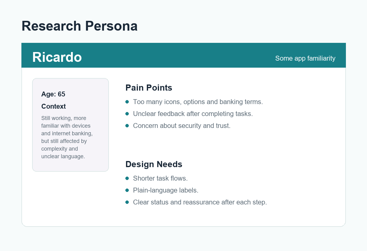
The research produced two personas and empathy maps representing different relationships with technology: one person with lower digital familiarity and another with more experience using apps.
04 · Findings
The strongest signal was not age. It was perceived risk.
The clearest pattern was fear of making a mistake with money. That fear connected to several practical barriers: small text, complex language, too many options, unfamiliar symbols, difficult login flows and weak feedback after actions.
Fear of costly mistakes
Interviewees described insecurity around tapping the wrong option or moving money unintentionally.
Banking language created distance
Acronyms, English terms and technical wording made key actions harder to understand.
Support mattered
Access to a real person was repeatedly connected to confidence, welcome and trust.
05 · Recommendations
The recommendations focused on clarity, reassurance and control
- Use larger text, stronger contrast and simpler layouts to reduce visual effort.
- Replace acronyms and technical terms with plain, direct language.
- Add confirmation before important actions and clear feedback after each step.
- Offer step-by-step guidance with images, especially for unfamiliar tasks.
- Keep access to human support visible instead of treating the app as a full replacement for help.
06 · Synthesis
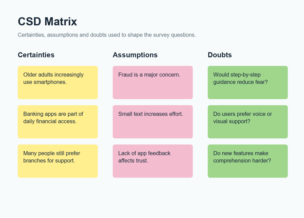
The CSD matrix helped turn desk research into better questions
The team used a certainties, assumptions and doubts matrix to decide what the survey needed to ask. It kept the research grounded in what was already known while making uncertainty visible.
07 · Reflection
Contribution and next steps
This case shows research maturity: accounting for different levels of digital confidence, combining methods under time constraints and translating findings into accessibility recommendations a product team could evaluate and test.
- Connected behavior, confidence and accessibility instead of treating age as a single design problem.
- Used research artifacts to make needs visible before proposing solutions.
- Translated the research into recommendations ready for prototyping and validation.